August 20, 2015 |

Mobile Websites: Difference Between Friendly and Responsive

Stay in the Loop

Get practical marketing insights, branding tips, and growth strategies delivered straight to your inbox.

Subscribe

In this day and age, the chance that your website’s mobile traffic is zero is zero. At least someone is viewing your website on a smartphone. Even if mobile traffic accounts for only 1% of your total website traffic, part of that 1% could be a busy executive with a huge budget ready to spend it on your product or your competitor’s product. If your mobile website experience is sub par, you risk potential customers.


So how do you get your site mobile-compatible in today’s competitive digital marketplace? If you don’t know the various ways a website can be optimized for viewing on a mobile device, read on.


Mobile Friendly: The Baseline Approach to Mobile Website Development


Some Website

Col 1

Col 2

Col 3


Some Website

Col 1

Col 2

Col 3


A mobile-friendly website is a site developed to display pretty much the exact same way on a desktop browser as it does on a mobile browser. The only difference is that smartphones have smaller screens, and mobile-friendly websites will appear smaller on those screens. A mobile user will have to zoom and pan around the web page in order to navigate and consume your content since everything has been minimized to fit on the tiny screen. Everything should still work as it does on a desktop browser but the experience is somewhat degraded overall. Basically, a mobile-friendly website is just a regular website with elements that make it pass as “usable” on a mobile device. Aside from a very few exceptions, no website should launch unless it has mobile-friendly elements.


Some tips for any website that will be viewed on a mobile device:


  • Adobe Flash should be avoided since it won’t display on many mobile devices
  • Hyperlink all email and phone numbers (copy/paste on mobile is tedious)
  • Be wary of compact, complicated nested menu structures with lots of drop-downs – mobile devices don’t have a “mouse hover” action.


Responsive Website: The New Standard for Website Development

Responsive

Col 1

Col 2

Col 3

Where mobile-friendly is the bare minimum for a mobile website experience, a website using responsive design represents the new norm. A responsive website will respond to the width of the web browser; columns will collapse into their own rows, images will scale down, text size will increase, and menus will re-orient so that they’re readily workable with the touch of a finger. Click the “start animation” button to the left to see an example of how a website responds to the width of a user’s browser.


Much like mobile-friendly, responsive websites work as both a desktop website and a mobile website, though they’re just one website with the same content and code base. A responsive website takes the elements of mobile-friendly and expands them to make the user interface automatically adjust for small screens.


[See Also: Mobile vs. Responsive Design: Strategies to Keep your Site Relevant]


What’s the Best Route for a Mobile Website?


Responsive design has been around for a while, and there really isn’t any reason to not incorporate it into new website projects. Special cases that might not require responsive design would include browser-based desktop apps or websites that are mobile optimized (see below). Responsive design is so prevalent, it can actually be more difficult to build a site that isn’t responsive at this point in time than it is to include responsive design by default. For example, most WordPress themes and CSS libraries are now responsive by default.


A Note About Mobile-optimized Websites


Years ago, when smartphones were coming on the market and had rudimentary web browsers (like the Motorola Razr), companies with deep enough budgets utilized mobile-optimized websites. Unlike mobile-friendly or responsive websites, mobile-optimized websites were essentially stand-alone sites that ran alongside the corresponding desktop version. When a user on a mobile phone requested http://somewebsite.com/article/ , the web server would sniff the request to see if it was coming from a desktop or a mobile browser. If it came from a desktop, the desktop version of the web page would be sent back. For phones, the mobile version would be sent back. While very effective, this setup was usually more complex to implement, and often required maintenance of two sets of content and code.


Understanding how your site’s visitors access your website is the first step to establishing a plan of attack for your mobile deployment. Recently, Google implemented an algorithm update that encourages all site owners to really consider their mobile experience. If you would like to learn more about responsive web design, get in touch and we’ll be happy to walk you through your options.


Thoughtful strategy. Practical execution.

Clear thinking, honest perspectives, and experience shaped by years of doing the work. No shortcuts, no borrowed opinions, just lessons learned by showing up, solving problems, and following ideas all the way through.

Four hikers with backpacks walking along a rocky mountain ridge under a blue sky
May 8, 2026
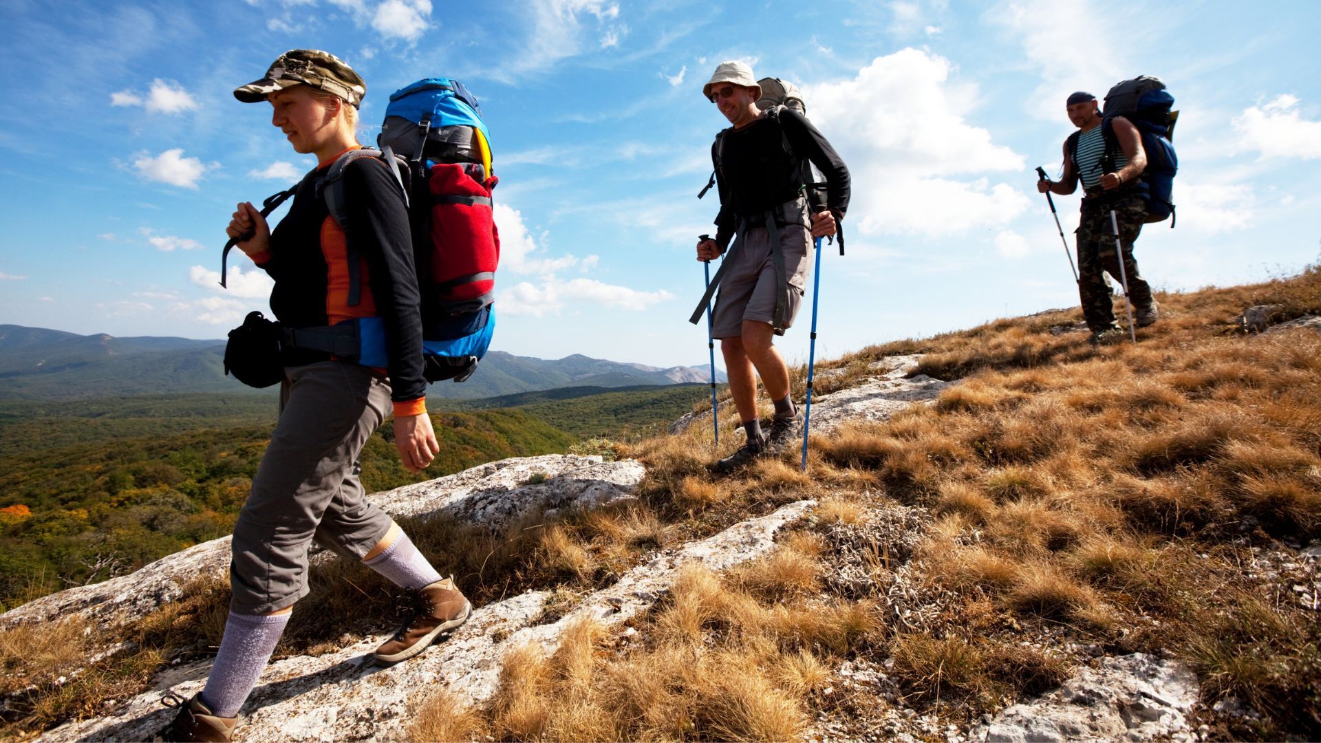
We are each our own greatest inhibitor. People don’t want to do new things if they think they’re going to be bad at them or people are going to laugh at them. You have to be willing to subject yourself to failure, to be bad, to fall on your head and do it again, and try stuff that you’ve never done in order to be the best you can be. ~ Laird Hamilton Yesterday: Hit Range Balls/Hike – Casa del Critters, 1:15 Today: Run – GGCSP, ~2 hours Tomorrow: Ride – Somewhere singlespeedy, ~2 hours Yesterday, Rach and I took a nice stroll in the woods around our house. The songbirds were going crazy-nuts and surprisingly, we only saw one other person walking his dog. I love where we live – close proximity to fun trails and the ability to get away from it all in just a short walk from our house. During lunch yesterday, I went to the driving range to get a few cuts in before playing a round of golf with my dad next week. I don’t get to play very often so need to brush up on my skills (or lack thereof) whenever I can. I am looking forward to playing with my pops and hope to break 100. I shot a 102 the last time I played so I am within striking distance of the sub-triple-digit score. We’ll see how things go. I usually do okay for most of the round and then fall apart on a couple of holes pushing my score way up. Dad shoots in the low 80s usually (I think). I am not sure I will ever play enough to be that good but it is fun to get out on the course now and again. I also went to see Dr. Paul yesterday for my ankle problem (which seems to have been resolved) and my knee (which is still a bit swollen but has decreased in size markedly over the past several days). The knee stems from my unscheduled nose-dive back in May (see this post for details). The shot some pictures and believe that everything is a-ok so that was good news. I just need to select better places for splashdowns in the future. And today is Luke’s birthday. Age is one place where I will always beat him but visit his blog to congratulate him on trying to catch up. Until next time…
Runner silhouetted at sunset on a rocky trail, mid-stride between hills.
May 8, 2026
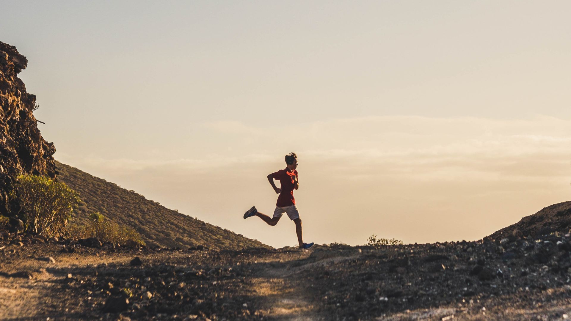
Progress comes from the intelligent use of experience. ~ Elbert Hubbard Yesterday: Run – Casa del Critters/Flume, 1 hour 15 minutes Today: Ride/Hike/Relax Tomorrow: Run/Hike – Pawnee/Buchanan Passes, 6 hours? Yesterday I ran around the house. Not literally, mind you, but in the neighborhood. It was a gorgeous evening – calm, cool. Perfect. The wildflowers are really starting to take off up here and I was treated with a bold display of color throughout my run. Tons of Columbine lined the trailside as I ran on old mining roads and singletrack trails. It is really fun to see how much differently I am able to handle familiar terrain. I used to have difficulties running this loop and would have to walk major sections. Last night, I ran the entire loop without trouble and was able to moderate my speed to maintain a steady cadence through the run. Good times. Contracting is staying steady. A bit of a drop-off this week given the holiday but I am still managing to put in a decent number of hours. I picked up another new project today and will need to get started immediately to ensure that it gets completed on time.  Tomorrow, we are going to head up Pawnee Pass and loop back around to Buchanan Pass in the northern Indian Peaks Wilderness. This should be a fun challenge as we’ll get up pretty high, have to navigate some snow (most likely) and will be out for quite awhile. I am looking forward to it for sure . Movie time: I forgot to mention Shopgirl, a Steve Martin vehicle, we watched the other night. I wasn’t quite sure what to expect but found this to be a charming film about loneliness. It was well acted and would recommend it for sure. The pacing is steady throughout and some might find it a little on the slow side but it was an engaging film that had a lot to say without being overly sappy.
Hands holding a tablet displaying a video player interface. The video is paused.
February 20, 2026
In case you hadn’t seen these (and also for my friends at Adventure Film ), here are a couple of must-see running movies from Joel Wolpert:  Geoff Roes: Slogging to the Top